AWallet
Concept.
A tactile visual language for a non-custodial crypto wallet. Designed around the moments that need your attention.
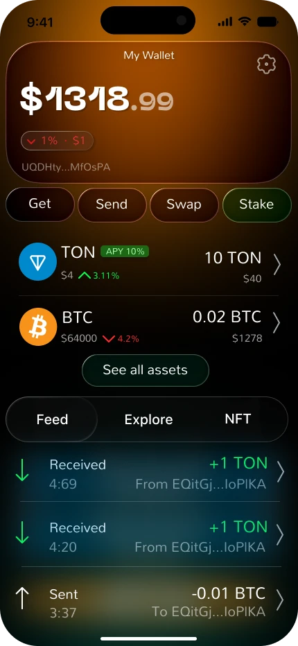
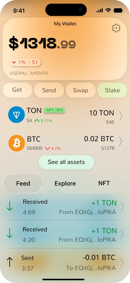 One wallet. Two perspectives.
Make the important
feel obvious.
A wallet interface asks people to make decisions about addresses, networks and assets. When every detail competes for attention, even a familiar action can feel uncertain.
My focus for this concept was a visual hierarchy that separates the overall balance, core actions and recent activity. The intention is to give each task a clear place, while retaining a distinctive, tactile character.
This is a self-initiated interface concept. The presentation shows design decisions and screen studies, not a released product or measured usability results.
Same rhythm.
Different light.
Warm surfaces, strong numerical hierarchy and softly separated layers give the balance and primary actions distinct roles. The light and dark explorations preserve the same structure.
Compare the original interface screens.
A moment to enter.
A moment to check.
Separate composing a transfer from reviewing it. Let the final state make the outcome unmistakable.
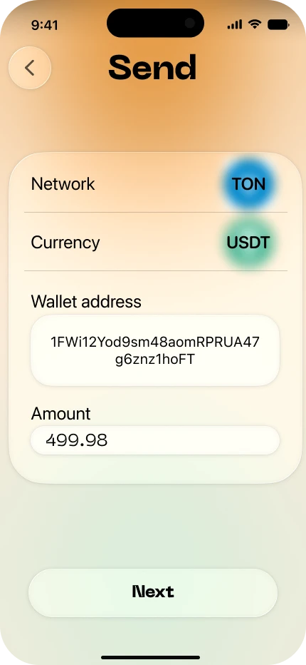
Put the details in one place.
Network, currency, destination and amount are grouped into one clear entry surface. A single next action moves the user to review.
Independent screen studies; example amounts vary. Playback demonstrates the presentation, not a functioning wallet.


Care at the
critical moments.
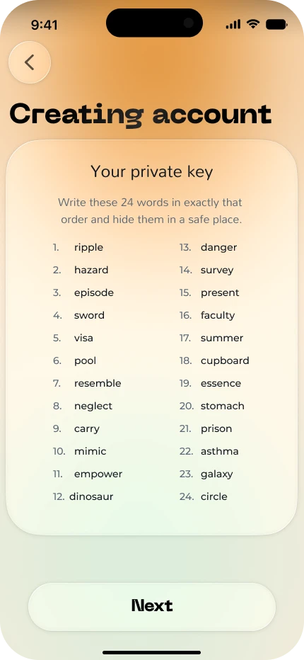
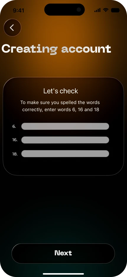
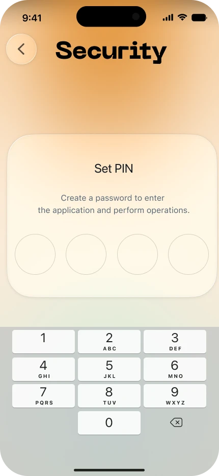
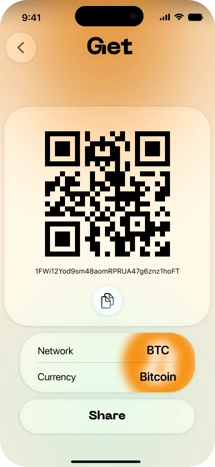
Backing up access deserves its own sequence. These studies separate viewing the recovery phrase, verifying selected words and setting a PIN. Receiving assets uses a dedicated QR surface.
 Enlarge image
 Enlarge image
 Enlarge image
 Enlarge image
Interface exploration only. Visual reassurance is not evidence of technical security.
Distinctive in form.
Clear in purpose.
The concept brings the wallet’s overview, access and transfer screens into a consistent visual family. Typography and spacing establish hierarchy; colour and depth distinguish the key surfaces.
The next useful step would be to test the clarity of labels, address review and recovery guidance with people using wallets. That validation remains outside the scope of these screen studies.
Let’s talk about the design