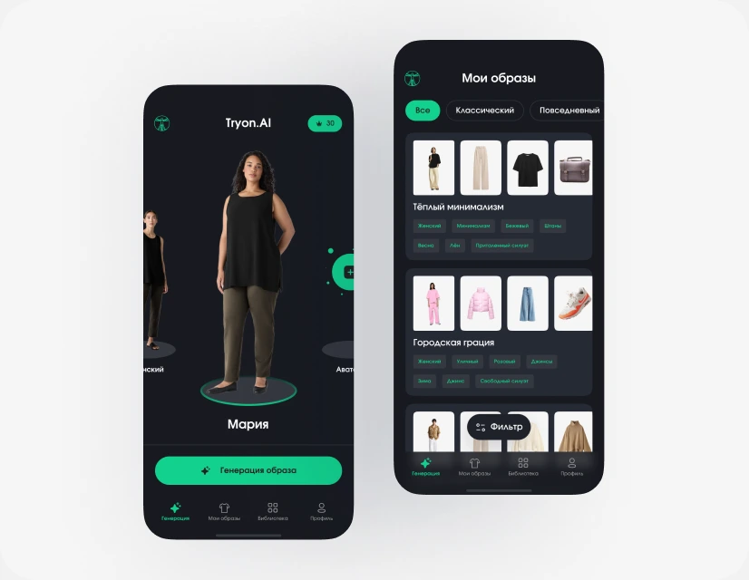
AI-стилист
Примерка образов на вашем 3D-аватаре.
Открыть кейс →Three connected website sections: show the work, establish trust and make the next step easy. A focused UI design project for an app development studio.
UI design · Layout · Interaction statesThe task was to design three blocks within an existing website. Each needed a distinct purpose while sharing the same visual language: restrained surfaces, clear typography and a blue accent.
I organised the content into a simple sequence. Product examples explain the studio’s work; editorial and review cards support credibility; the final CTA gives a visitor a clear starting point.
A larger featured project anchors the section. Two compact cards extend the range without competing with it. Product imagery, concise descriptions and consistent actions keep the scanning path clear.
Превращаем идеи в продукты. Вкладываемся в запуск и развитие.
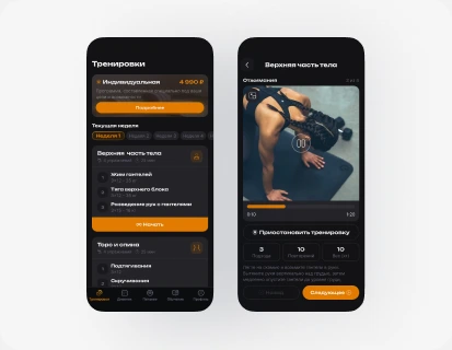
Авторские тренировки и подбор питания с помощью ИИ.
Открыть кейс →Примерка образов на вашем 3D-аватаре.
Открыть кейс →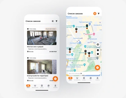
Подрядчики, прозрачная смета и безопасная сделка.
Открыть кейс →Channel, review and publication cards have separate roles. Review sources stay visible, and feedback from clients is distinguished from employee feedback. The layout can be understood quickly without turning the section into a wall of logos.
Как мы думаем и работаем. И что о нас говорят другие.
Разборы приложений, решения команды и опыт запуска продуктов.
Смотреть выпуски →Проекты, находки и решения в процессе, а не только на финише.
Читать материалы →Публикации AppBusters →
Разбор процесса и подхода →
The final section welcomes an unfinished idea. A short three-step explanation sets expectations before a visitor starts a conversation. The design balances the invitation with a compact project brief.
Нет готового ТЗ? Это нормально.
Обсудим задачу и определим, что нужно вашему продукту на старте.
Сначала познакомимся. Решение о работе — после.
Начните с нескольких слов о проекте.
The deliverable turns a project collection, studio credibility and a final CTA into a connected sequence. Figma colour variables, type styles and reusable components keep the sections consistent and provide a base for future content. The result is a structured website design ready to hand over for implementation.
The Figma work included reusable cards, type styles, colour variables and hover states. A consistent spacing rhythm keeps the sections connected, while image scale and card hierarchy guide attention.
This portfolio presentation adapts the three-block layout and preserves its visual direction. Product mockups are supplied AppBusters materials; my work is the website section design and its interaction states.